I'm finally back with another post focusing in a bit more detail about the job of a visual merchandiser, it's been a while since I posted any photos of our displays and hard work in store so this is the perfect opportunity to share with you what I've been up to!
So my job these last few weeks has become increasingly hectic due to Model Store judging.
So my job these last few weeks has become increasingly hectic due to Model Store judging.
Model Store for me and my job is when we as a visual team work tirelessly to make our store look the best it possibly can for customers, staff and the like and after many weeks of prep someone from high up within the company comes out and judges us on several criteria.
My job as a visual merchandiser involves presenting well thought out mannequins that were pinned well, dressed appropriately to the stock on the mat, create various hotspots throughout the store at key sightlines to promote stock within the store and change over our windows to designer stock which would encourage customers to come into store. We were also doing general maintenance such as cleaning, painting and touching up mannequins to make them look pristine in condition.
Aspects such as colour flow, power of three, trends and layout were all key in the process to ensure the customer journey was carried out consistently through the store and looked chic.
Last year one of our big criticisms was that we went over the top with our displays and as a result they were too busy and detracted more from the stock within the store rather than enhance it.
Below I have a whole bunch of photos to share with you all, showing you the standard we set this year and I'll describe underneath what we were trying to achieve to explain to you all in better detail because it can sound a little confusing.
So here you go! My stores model store displays for S/S15! If we've done our job properly you should look at these and immediately think "oooh wheres that stock?!"
Our main Safari tend catwalk
Priority One window, the blues and stripes trend
70s hotspot
Swimwear mannis, note that the blue and red colours flow up to the handbags at the far end of the walkway (colour flow)
Our Wedding Gifts hotspot. Lots of power of three
A home hotspot, again lots of power of three and repetition, good colour flow between the products
A hotspot at out luggage department to promote sales
One of our bed displays
Another bed display
Collection formal first catwalk
Collection formal second catwalk
One of the lingerie hotspots
Ted Baker
Lingerie pillar with a display on the top
Another angle of the Safari trend catwalk (notice how the floral print is continued throughout the mannis)
Rocha manni display, good colour flow through mannis to match back wall merchandising and the height difference creates interest
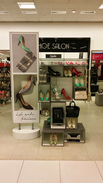
A shoe hotspot
BDL mannis
Blues and stripes hotspot at the top of the escalator (this continues the story from our front window into the store)
Jasper hotspot (notice all the blue?)
Behind the hotspot at the top of the escalator (rails have been added to the clothes can be shopped immediately after seeing the mannis)
Toddler boy hotspot
Girls hotspot at height to draw attention
Swimwear hotspot, good symmetry here
Young fashion, mannis placed beside each fixture wearing the clothes to promote sales
Same again
Same principle but beside a graphic rather than a fixture
Tropical hotspot
Henry mannis, situated at various heights to create interest, good colour flow
Mother day hotspot in the lift area, lots of power of 3
Hotspot at the bottom of the escalator with shoppable rails
Side view of the hospot, notice the detail on the catwalk continues up the wall
Mens catwalk, maroon and blue colour flow
Mens suits catwalk using staggered height to create interest
Purple catwalk
Pale blue young fashion mens display at height
Mens shoppable hotspot at the back of the escalator for our mac trend
So you may have realised that a lot of blue was projected around our store this year, Dark blues in womenswear, teals in home and the brighter blues in our young fashion areas. This helps carry a shopper through the store and is pleasing to look at. There was a lot of good merchandising in the store using these colours to enhance the journey as well but I have no photos of them.
If there's a certain display you like or want to comment on leave your thoughts down below!!


Wow this was so interesting - I often look at displays but never have before understood the theory behind it all. I shall look at them differently now - thanks for sharing x
ReplyDeleteIt becomes really addictive! I can't go shopping now without having a visual mentality haha!! Thanks for reading! X
Delete